4.4 Creating a classification model
This section outlines the steps for creating a classification model to analyse hyperspectral data by accurately defining target categories and configuring training parameters. A properly developed classification model facilitates reliable identification of objects within the dataset using spectral characteristics.
Within the Breeze software, classification models are developed for the automated identification of plant diseases based on selected features and diagnostic parameters. Typically applying decision tree algorithms, the model learns to segment diseased plant regions, providing a basis for predicting outcomes on new data.
To initiate the creation of a classification model, go to the “Model” menu on the left panel, where existing models can be accessed or a new one started (Figure 54).
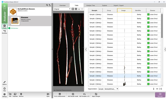
Figure 54 – Accessing the “Model” menu to add a new model
Next, press the “Add” button found in the bottom-left panel to open the Model creation wizard. Then, select the third option - “Classification”, and select the PLS-DA method (Partial Least Squares Discriminant Analysis) - specifically designed for managing categorical target variables (classes) (Figure 55).
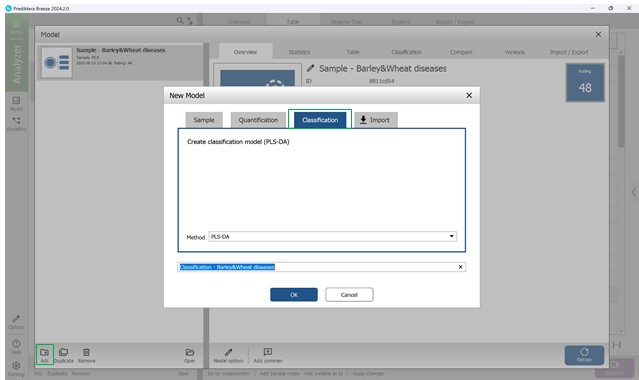
Figure 55 – Choosing the PLS-DA method for classification
The classification model creation involves the following stages:
- Step 1: Variable selection (Figure 56);
- Step 2: Choosing samples, specifically the affected crop regions (Figure 57);
- Step 3: Defining wavelength ranges within the raw spectral data of affected regions - usually all wavelengths are included by default (Figure 58). This step also covers examining: model loadings (Figure 59) and weight coefficients based on principal components within the selected wavelength range (Figure 60). Additionally, significance indicators (Figure 61) and signal-to-noise ratios for the chosen wavelengths are reviewed (Figure 62). Preprocessing is carried out using the SNV method (Standard Normal Variate correction), which minimises variability caused by differences in sample density, thickness, and multiplicative light scattering effects in spectral data;
- Step 4: Computing key statistical parameters for the PLS-DA model, focusing on components PC1 through PC5 (Figures 63, 64). The “Score Variance” plot helps identify possible outliers within the sample set. The “Overview” chart presents model quality metrics such as R² and Q², along with the number of components used. R² measures how well the model fits the training data (coefficient of determination), while Q² evaluates its predictive performance on unseen data (predictive ability). The optimal number of components is typically chosen at the point where R² and Q² plateau (e.g., component 3) (Figure 64). “Distance to Model” plots indicate how far each sample deviates from the model in the X-variable space, flagging potential outliers when exceeding a set threshold (black line);
- Step 5: Assessing the finalised PLS-DA model through three primary visualisations: “Observed vs. Calculated”, “Overview”, and “Variable overview”. The “Observed vs. Calculated” plot compares actual sample classes with model predictions, illustrating class differentiation. The “Variable overview” graph displays R² (the model’s ability to separate training classes) and Q² (predictive accuracy for detecting disease in crop regions during cross-validation) for each class. The process concludes by clicking “Finish” to complete the classification model creation (Figure 65).
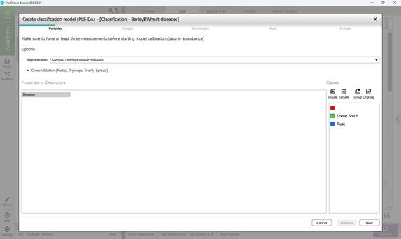
Figure 56 – Creating a Classification model: variable selection
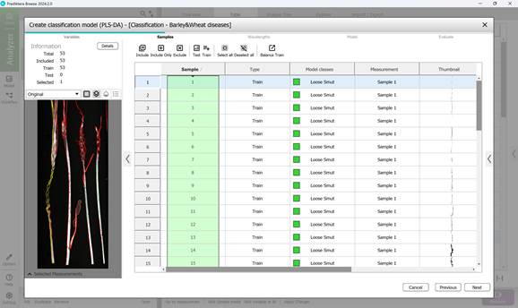
Figure 57 – Creating a Classification model: sample selection
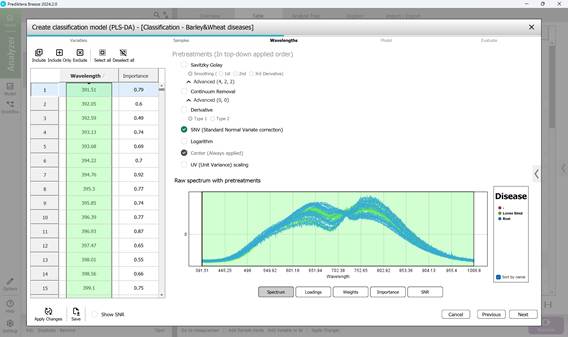
Figure 58 – Raw Spectrum of individual infected regions of samples within the examined wavelength range
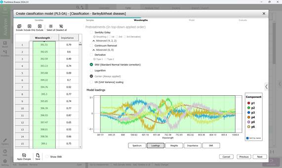
Figure 59 – Model loadings on principal components during classification model creation
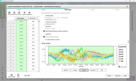
Figure 60 – Weights on principal components during classification model creation
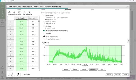
Figure 61 – Importance indicators in classification model creation
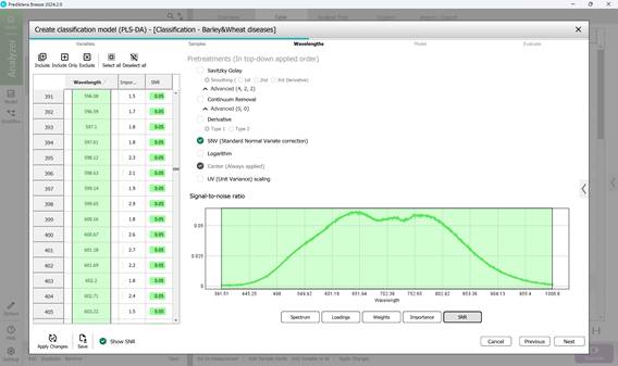
Figure 62 – Signal-to-noise ratio across the wavelength range in classification model creation
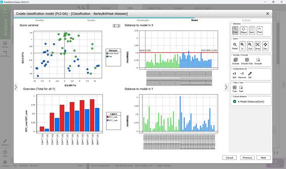
Figure 63 – PLS-DA model calculation: analysis of PC1 and PC2 parameters
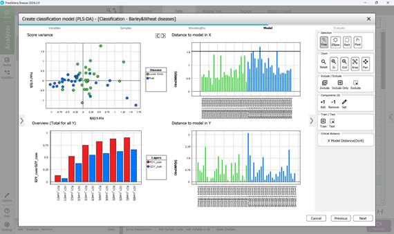
Figure 64 – PLS-DA model calculation: analysis of PC4 and PC5 parameters
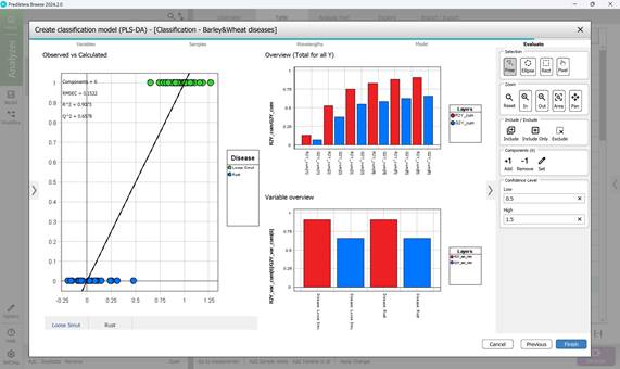
Figure 65 – Evaluation of the created PLS-DA model
Comprehensive details about the developed PLS-DA classification model - including its statistical performance, predictive accuracy, and core evaluation metrics - can be found within the “Model” menu by exploring its various sections. The “Overview” section presents a concise summary of essential parameters, including the total number of samples, spectral bands, number of principal components, wavelength interval, applied preprocessing techniques, cross-validation configuration, segmentation model used, and other relevant settings (Figure 66).
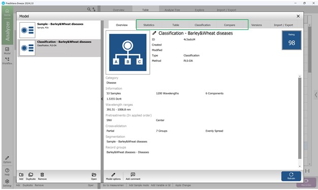
Figure 66 – General information about the created PLS-DA model
The second section within the PLS-DA model’s “Model” menu offers a range of visual statistical representations. The “Score Variance” chart highlights the proportion of variance captured by each model component. The “Observed vs. Predicted” graph depicts how well the model distinguishes between classes, plotting actual class labels against those predicted by the model for individual samples. The “Overview” chart summarises key performance indicators such as R² and Q². The “Variable overview” chart shows how each input variable contributes to class separation, reflecting both variance and relevance across categories. The “DModX” chart assesses how far each sample deviates from the model in the X-variable projection space. Samples that fall beyond the critical threshold - determined using a 95% confidence level - are flagged as potential outliers (Figure 67). Detailed numerical results and complete statistical outputs are available in the third section, “Table”, under the “Model” menu (Figure 68).
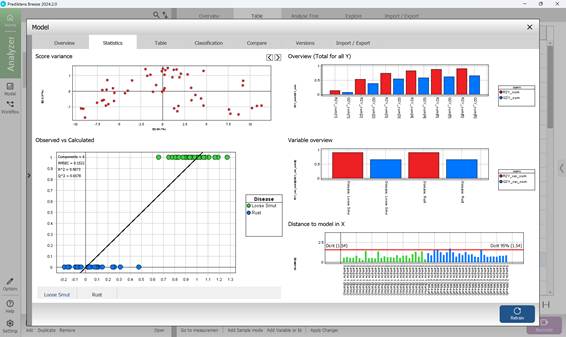
Figure 67 – PLS-DA model statistical graphs
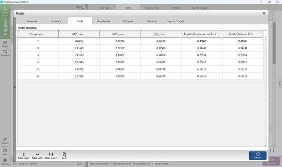
Figure 68 – PLS-DA model numerical statistics
The fourth section, named "Classification", displays the confusion matrix (Figure 69), which offers an overview of the model’s classification accuracy. In this matrix, columns represent the predicted disease categories, while rows indicate the actual labels based on predefined characteristics of crop samples. As illustrated in Figure 69, only a single sample (1.89%) was incorrectly identified. To fine-tune how confidently the model classifies affected regions, a confidence threshold can be applied. This threshold allows for statistical adjustment of the confusion matrix outputs. Setting a higher lower-bound value increases the model’s strictness, requiring a stronger correlation between sample features and known disease patterns before classification occurs (Figure 70).
The confusion matrix enables direct comparison between predicted and actual disease labels. Model performance is evaluated using three primary metrics - Precision, Recall, and F-score - each calculated separately for individual disease types to provide a clearer, more objective picture of the model’s effectiveness in identifying specific crop infections.
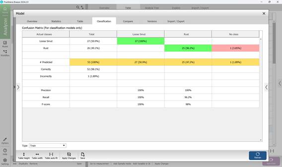
Figure 69 – Confusion Matrix
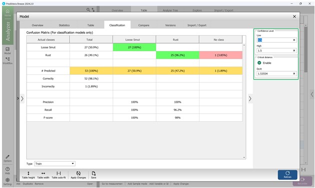
Figure 70 – Statistical analysis of Confusion Matrix values including confidence interval
The fifth section within the "Model" menu, labelled "Compare", allows users to assess and compare key classification indicators across multiple models (Figure 71).
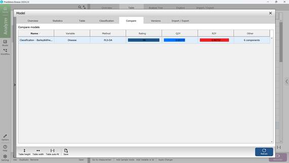
Figure 71 – Comparison of key statistical metrics of classification models
To leave this section, simply close the "Model" menu by clicking the “X” in the upper-right corner.
During most configuration steps, default settings are generally applied but can be modified if needed. The model is trained using labeled data that includes known characteristics of infected regions, enabling it to automatically identify and classify damaged regions in newly processed images.